Business Card Setup
Whether you are a skilled graphic designer or someone who is making their very first business card design, anyone can benefit from these simple tips for setting up your business card design.
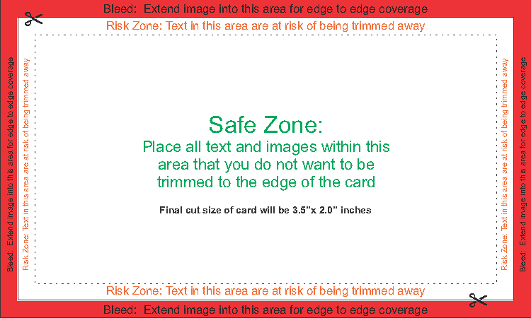
Looking at our example below… you can see that there a few ground rules to keep in mind when starting your card design.
CARD DIMENSIONS:
The most common size of business card is 3.5″ inches wide, by 2.0″ inches tall. If you are intending for a simple card design with no images or text that are intended to purposely extend past the edge of the card, the document settings you choose when creating this file should be set to this size.
However; if you are intending to have a fully colored background or an image/photo that runs to end of the card, you must increase the size of this document to add an additional 0.125″ inches all around. This would mean that your document size should equal 3.75″ inches wide by 2.25″ inches tall to account for the “bleed” area that is required for this particular technique.
BLEED:
Bleed is required when a full background colour or image is intended to extend to the very edge of your business card design. By placing these types of images in a manner that extends 0.125″ inches past the cut line of the card, this will ensure that your image will not have any accidental white space at the edge of the card after it’s been trimmed down to its final size of 3.5″ inches by 2.0″ inches.
SAFE ZONE:
This is where the key elements of your design should go. In general, keeping your text left or right justified to the edge of this “safe zone” will produce a clean and professional look for your card. However, feel free to be as creative as you want with your card design.
RISK ZONE:
Placing any important information within 0.125″ inches from the cut-line of the card will be at risk of being partially trimmed away. During the cutting phase, your stack of cards can shift ever-so-slightly from the intended cut-line. By placing your information more centrally in your design, this will ensure that all of your important information stays safe, and your card design stays looking fantastic!
FONT SIZE:
Choosing a font that is no smaller than an 8pt font size will help ensure that your text is clearly legible for anyone to read. Also, having certain lines of text that are purposely larger than the rest will naturally draw a person’s eye to that area, and add more importance to that line of text. This technique can make your card design more dynamic and professional looking.
However, as not all fonts are created equal, custom fonts can appear much larger or smaller in size than most regular fonts. Making a quick test print from your home computer will help you determine if a font is too small for your specific business card design.
 Example: Guides for business card design

Example: Guides for business card design overlayed on a designed card
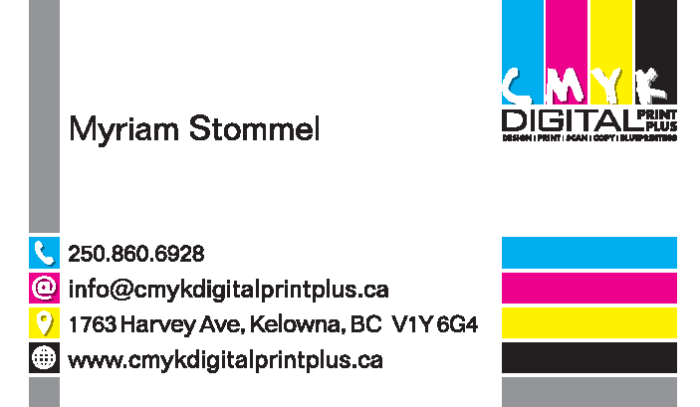
 Example: Final look of card
These design basics can be applied to almost every type of printing project (brochures, rack cards. posters, etc…). However, it’s a good general practice to ask your print shop what specifications your file is required to have. This will help ensure that your next printing project is completed on time, and on-budget!
